Utility Components
The page for all utility components.
Main Components
Hoverable
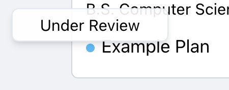
A multi-functional tooltip for any element. Can be used to display a tooltip on hover, or to display a tooltip on click. An example usage is as follows.
<Hoverable
  as={
    <div
      className="flex items-center justify-center w-6 h-6 transition-colors duration-150 ease-in rounded-sm cursor-pointer hover:bg-gray-200"
      onClick={(e) => handleViewPlan(e, p)}
    >
      <EyeIcon className="w-5 h-5" />
    </div>
  }
>
  {({ hovered }) =>
    hovered && <TooltipPrimary width={120}>Inspect plan</TooltipPrimary>
  }
</Hoverable>
Dropdown
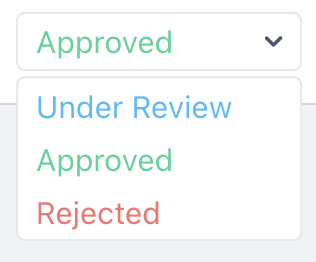
The general purpose dropdown component. Pass in custom (jsx) options and callbacks. An example usage is as follows.
<Dropdown
  width={130}
  options={[
    {
      label: "Under Review",
      content: <p className="text-sky-400">Under Review</p>,
      cb: () => console.log("Under Review"),
    },
    {
      label: "Approved",
      content: <p className="text-emerald-400">Approved</p>,
      cb: () => console.log("Approved"),
    },
    {
      label: "Rejected",
      content: <p className="text-red-400">Rejected</p>,
      cb: () => console.log("Rejected"),
    },
  ]}
  _default={statusReadable[status]}
/>